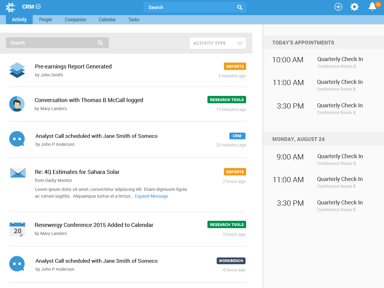
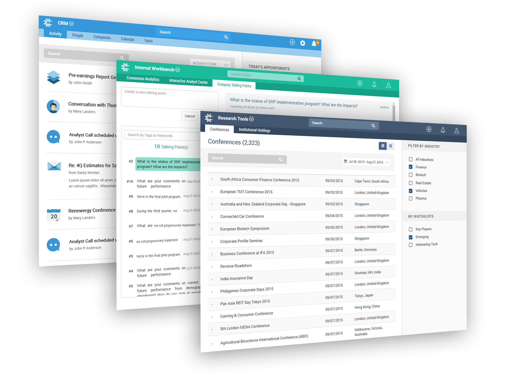
We did a competitive analysis to review similar CRM systems and identify common industry design patterns. After the thorough review of their current prototypes and feature list, we worked through key recommendations on how to pull the pieces they had begun into a cohesive app with uniform navigation. We also created a consistent user interface design language to help users intuitively understand controls and context within the app.
Many of the users would be new to Virtua’s platform, and we needed to onboard them to the powerful feature set without overwhelming them. Working with their talented team of in house developers, we developed a filtering concept that was lightweight and unobtrusive on the initial interaction but allowed access to powerful tools for the power user. We also introduced the idea of periodically notifying the user of “suggested filters” as a way to familiarize them with the advanced features. For example we could intelligently notify a user when a new set of relevant earnings reports became available.
Working closely with the development team to implement the user experience and visual design recommendations was critical to realizing the stunning product the client envisioned at the outset. The close collaboration and rapid prototyping allowed us to efficiently work toward improving the user experience, visuals and ensuring adherence to usability best practices.

