Buying NYC

Connecting With Customers Through A Compelling User Experience and Elegant, Fresh Design
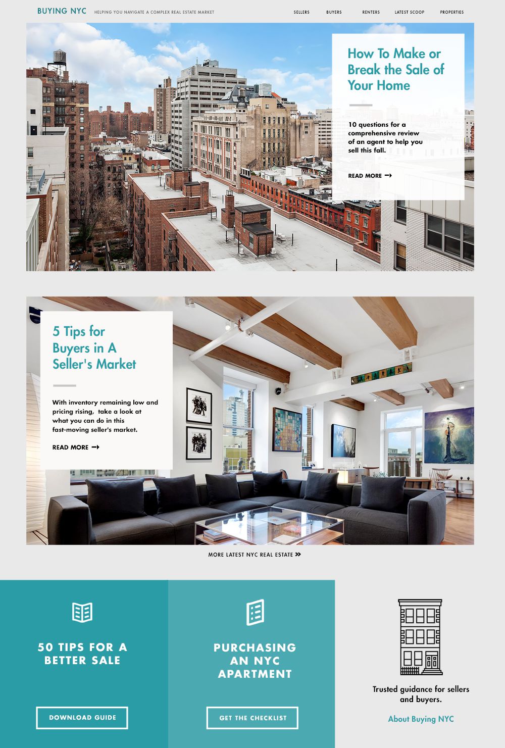
Buying NYC Homepage

Buying NYC challenged us with designing and building a website to help people navigate the complexities of New York real estate transactions. They sought to enhance their brand, build trust, and connect with an audience accustomed to more modern visual vocabulary. The site also needed to deliver leads to the agent team in a big way to prove its success. 

Our strategy focused around creating a hub of useful guides, checklists, and articles to aid users and establish Buying NYC as an invaluable reference tool. We paired that with elegant, fresh design language that elevated the brand to place it among the best new design today.

In addition to featuring timely content, we also designed audience specific pages targeted at telling the story of what to consider when entering one of these transactions and the best way to execute them. These pages break the process down into easily readable chunks which are supported by complementary visuals. We also had a mandate to make the site feel interactive, so including elements such as slideshows and videos was a great fit to strengthen the connection with viewers.


The sellers page walks through tips, photos, a video, and culminates in a downloadable guide that doubles as lead generation.
telling a story through a sectioned page
Leadgen form example
Across the site, we offer a helpful form at the bottom of each page as a natural next step.

Accustomed to looking at amazingly staged homes, sites like Houzz and Apartment Therapy, we knew our users wanted amazing photography and authentic articles. This section of the site is designed to mix property descriptions with interesting stories relevant to buyers and sellers.

Listing of housing related articles